Custom code extending Squarespace beyond its defaults to meet the project’s exact visual standard
Created By James – Web Development and Graphic Design
Menu
James Sanders Fine Art
A platform migration and full redesign delivering a virtual gallery experience for a fine art e-commerce site — combining minimalist aesthetics, custom code, professional photo editing, and brand-consistent promotional materials into a cohesive online presence.
Full
Platform Migration & Rebuild
Gallery
Quality Photo Editing & Presentation
Custom
Code on WordPress to Match Old Platform
360°
Brand — Web, Social & Print
Client
James Sanders Fine Art
Role
Web Designer, Developer & Brand Designer
Platform
WordPress + Elementor
Type
Freelance
Overview
A gallery on a screen – not just a website
Fine art demands a presentation that respects the work. This project required not only a full platform migration — faithfully recreating an established aesthetic from a previous platform — but elevating it into something that genuinely replicates the experience of walking through a physical gallery. Every design decision, from whitespace to color contrast to image treatment, was made in service of the artwork itself.
The Challenge
The Problem
Migrate without losing identity
The existing site had an established visual aesthetic on a different platform. The migration to WordPress required a full rebuild that preserved what worked while pushing the design further — without the luxury of just copying templates or components across.
The Approach
Custom code where the platform fell short
Where WordPress’s native tools fell short of the gallery experience required, custom coding and visual manipulation filled the gap — allowing precise control over layout, spacing, and image presentation that standard e-commerce templates don’t provide.
Areas of Work
01
Platform Migration
Managed the full migration from the previous platform to WordPress, reconstructing the site’s established aesthetic while refining and elevating the design to meet the standards of a professional fine art showcase.
02
Virtual Gallery Design
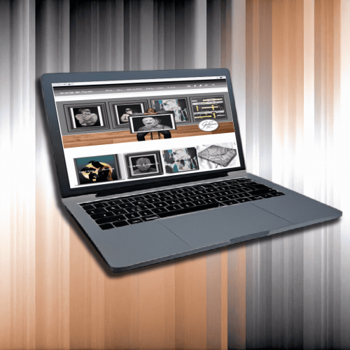
Designed a clean, minimalist interface that mirrors the experience of a physical art gallery — using strategic whitespace, controlled color contrast, and deliberate layout to keep the artwork as the undisputed focal point.
03
Professional Photo Editing
Refined all artwork photography using Adobe Photoshop and Illustrator — ensuring each piece is presented with the color accuracy, clarity, and professional quality that fine art buyers expect.
04
Custom WordPress Development
Applied custom code and visual manipulation within WordPress to achieve design requirements that exceeded the platform’s native capabilities — delivering a bespoke gallery experience on an accessible e-commerce infrastructure.
05
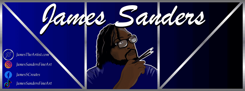
Social Media Graphics
Designed a suite of social media graphics for ongoing art promotion — crafted to maintain the gallery aesthetic across platforms and drive awareness to the e-commerce site.
06
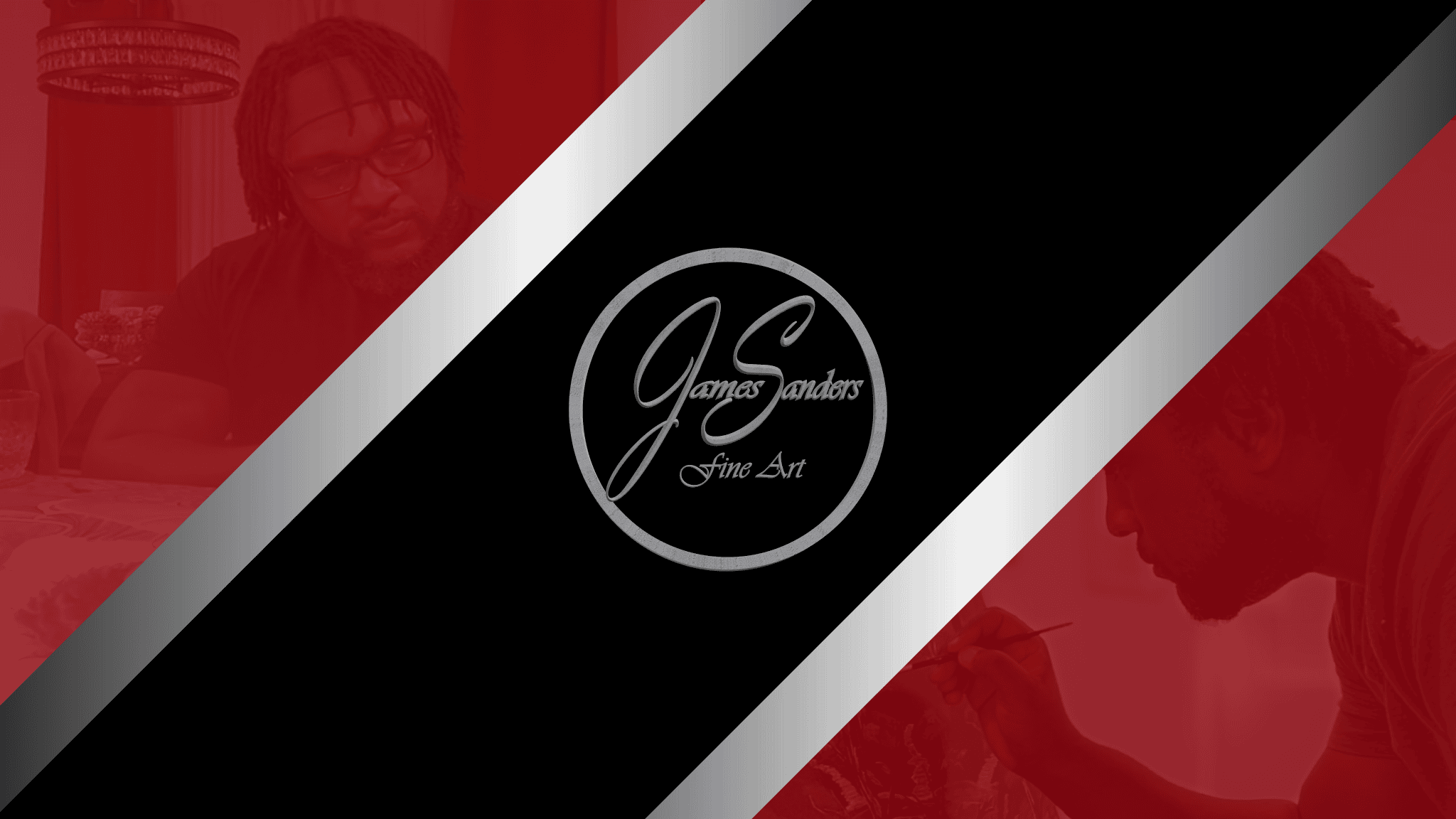
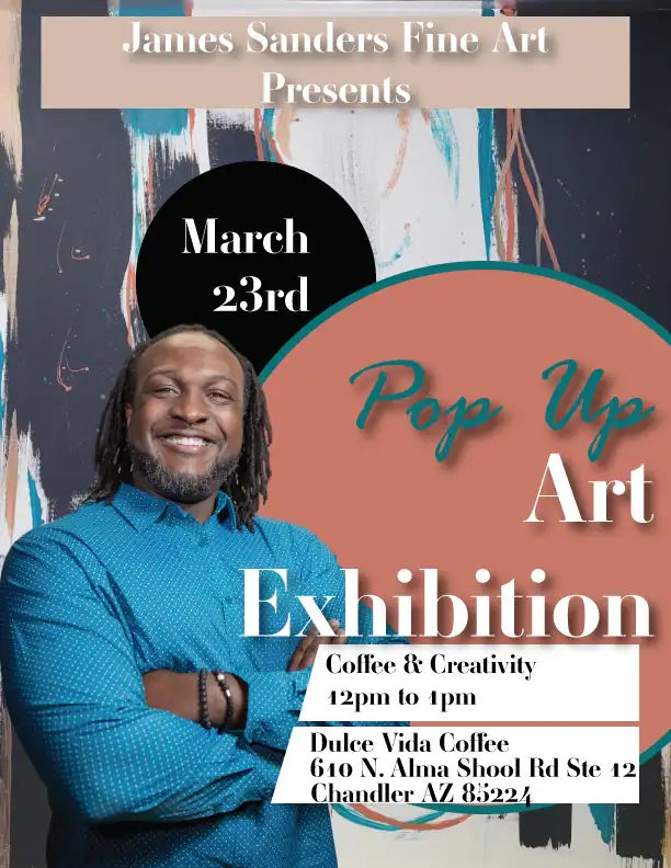
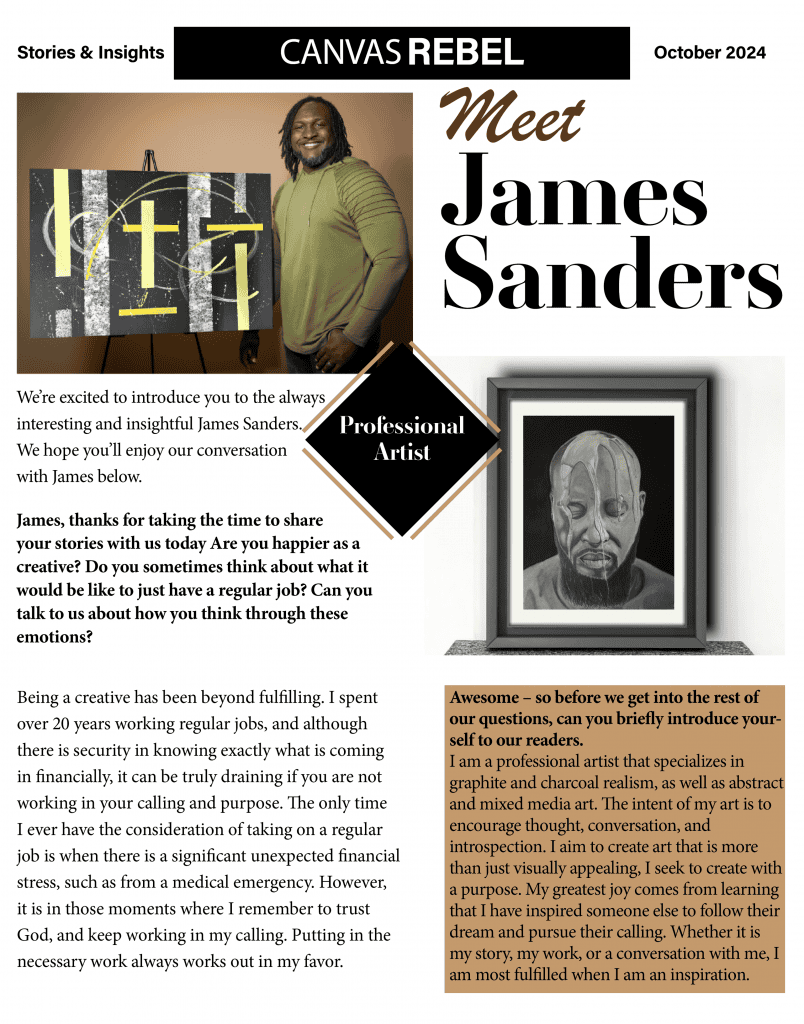
Promotional Materials
Created print and digital promotional materials to build brand awareness and support consistent visual identity both online and offline — ensuring the brand presents cohesively across every medium.
Mobile Design Process
Two designs. One cohesive brand
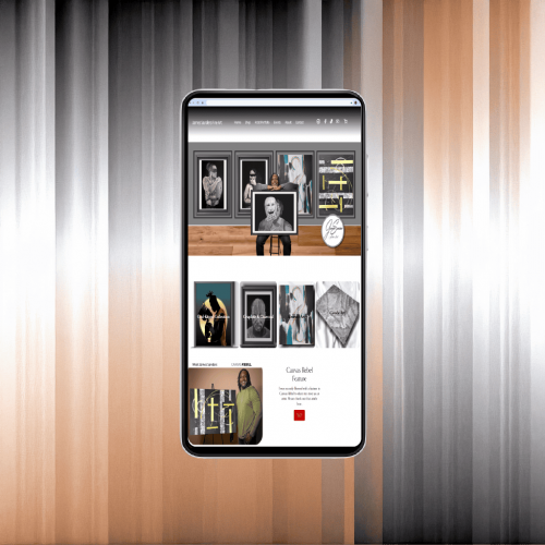
A fine art site demands precise control over how every image and element is presented — and automatic responsive scaling doesn’t provide that. Using Elementor, the desktop and mobile experiences were each designed independently, ensuring the gallery aesthetic holds up on any screen. The restraint and intentionality that defines the desktop experience was rebuilt from scratch in Elementor’s mobile settings rather than inherited from a breakpoint adjustment.
- Desktop layout crafted for the full gallery atmosphere and visual impact
- Image sizing and whitespace re-calibrated for smaller screen proportions
- Mobile layout rebuilt from scratch in Elementor’s mobile settings
- Gallery-quality presentation and minimalist aesthetic preserved on both platforms
Featured Focus
Design Philosophy
Art-first design — every element in service of the work
The guiding principle throughout this project was restraint. A fine art site succeeds when the design disappears and the artwork commands full attention. Every decision was made through that lens.
Minimalist layout with deliberate whitespace to replicate the gallery wall experience
Carefully balanced color contrast so artwork — not UI — draws the eye
Photoshop & Illustrator image refinement ensuring gallery-quality presentation on screen
Do you like this design? I’d love to the opportunity to create a version for your brand.